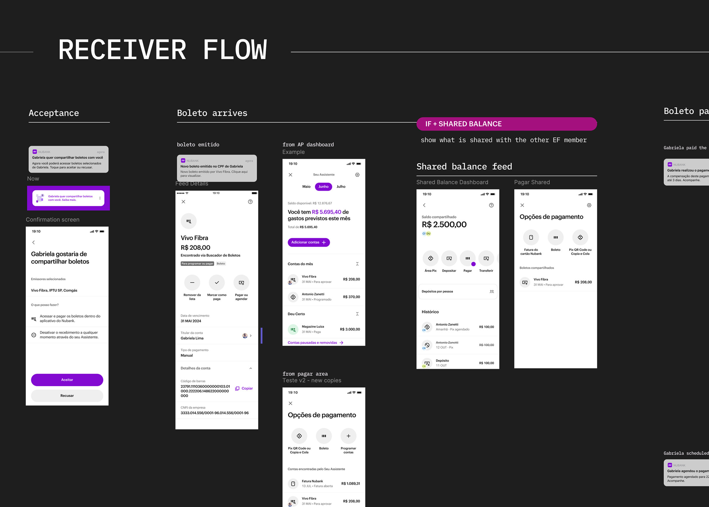
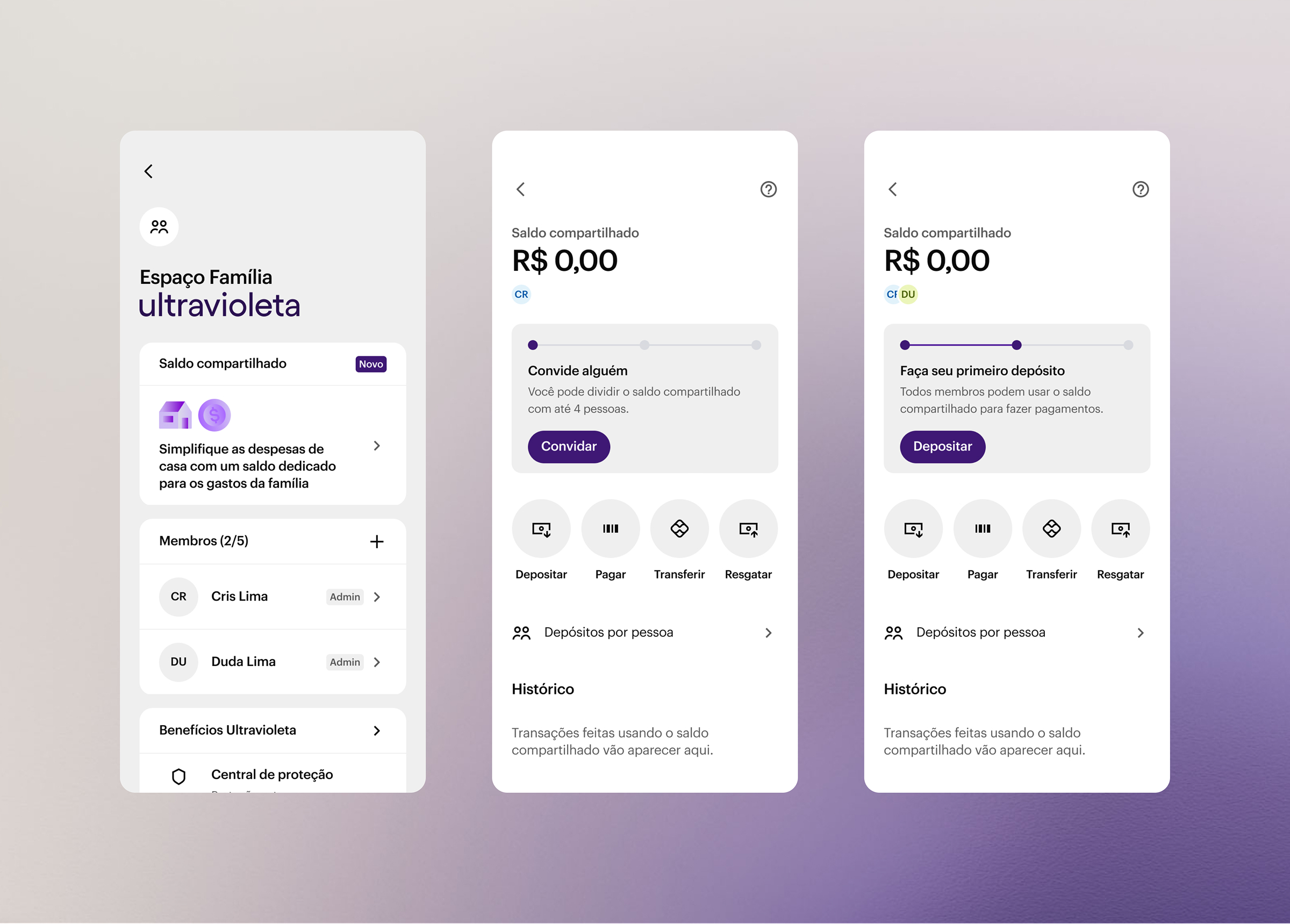
(II)
Design Focus: Solving Parity and Friction
My design work focused on resolving the two major obstacles to adoption: closing the functional gap and optimizing the user experience.
1. Functional Gap: Design flows to enable the Shared Balance to act as a funding source for all major payment and transaction methods, designing the new transactional screens and funding source selection flows to maintain a seamless, consistent experience with the core app.
2. User Experience: Design solutions to resolve customer pain points and improve accessibility, executing usability experiments and iterations to ensure complex concepts (like ownership and partner visibility) were intuitive, transforming a confusing separate experience into a cohesive first-layer app experience.
(III)
Key Design Deliverables & Impact
My work was instrumental in moving the Shared Balance from a feature-poor state toward Product-Market Fit by directly impacting core usability metrics, transaction volume, and feature parity. By the time I transitioned out of the team, the measurable impact included an increase in SES (Sean Ellis Score) and near-doubled average group transactions.
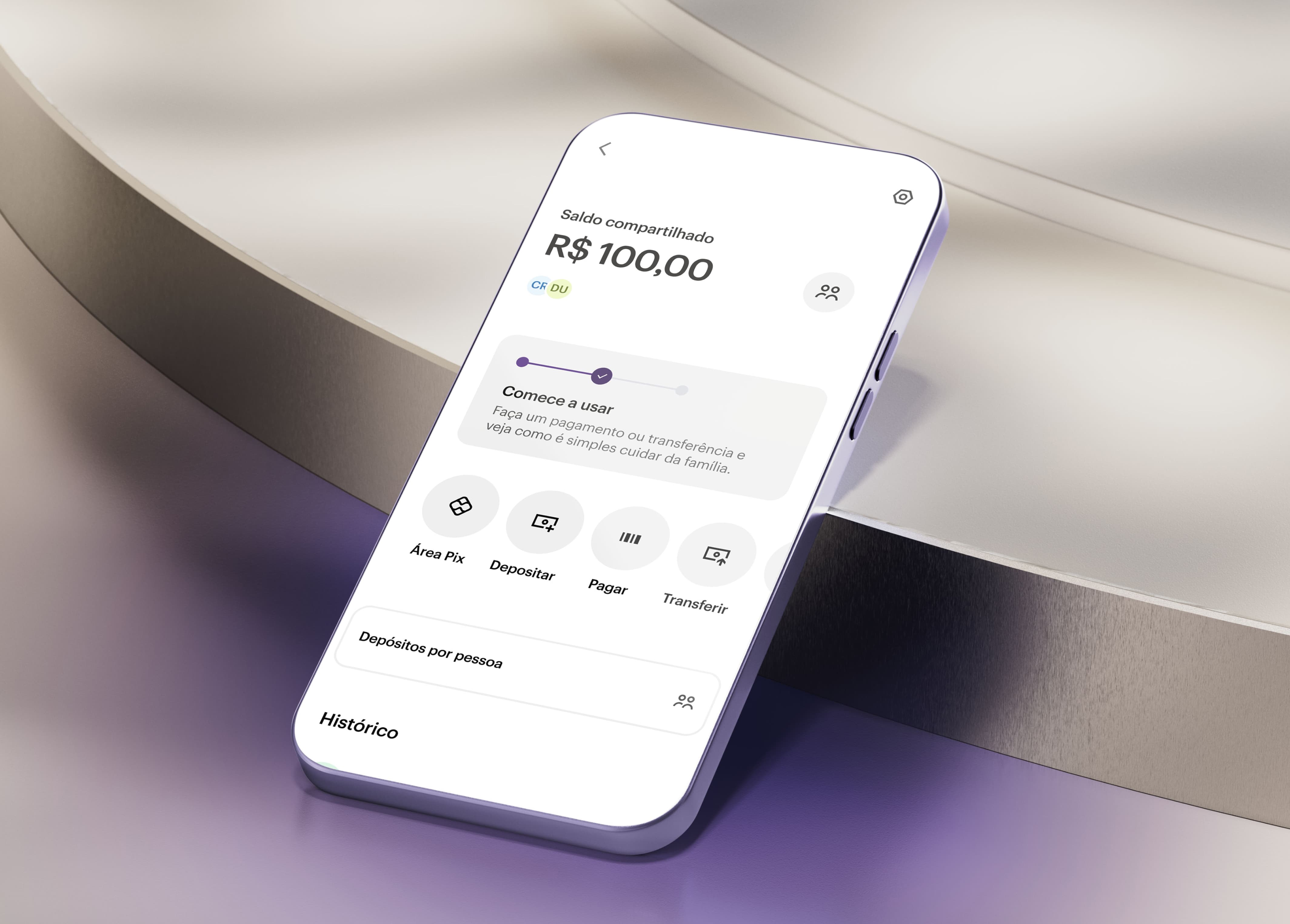
✎ Executing Functional Parity: Closed the functional gap, designing flows that granted the Shared Balance feature parity with the Individual Account. Enabled Shared Balance as a funding source for PIX, Boleto, and Credit Card Bill Payments, as well as Scheduled and Programmed payments, while running multiple UI fixes on the flow.
✎ Strategic Vision: Created design visions and strategic prototypes for 6-month, 1-year, and 3-year timeframes, defining the long-term UX architecture for shared offerings planned for 2025.
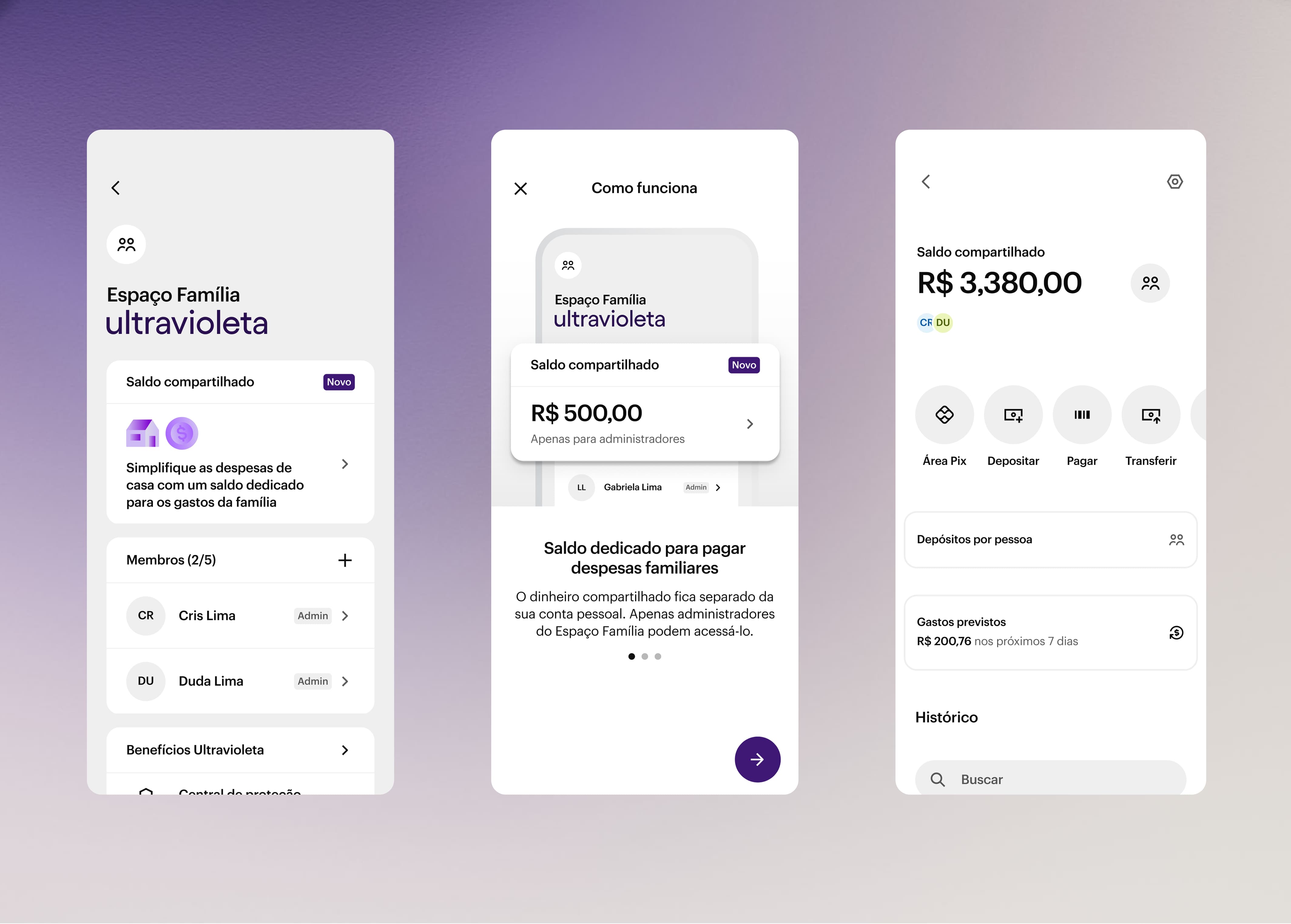
✎ Value Expansion: Designed initial user flows for the Shared Payments Assistant and Shared Boleto , to allow couples to easily get access to their shared bills.
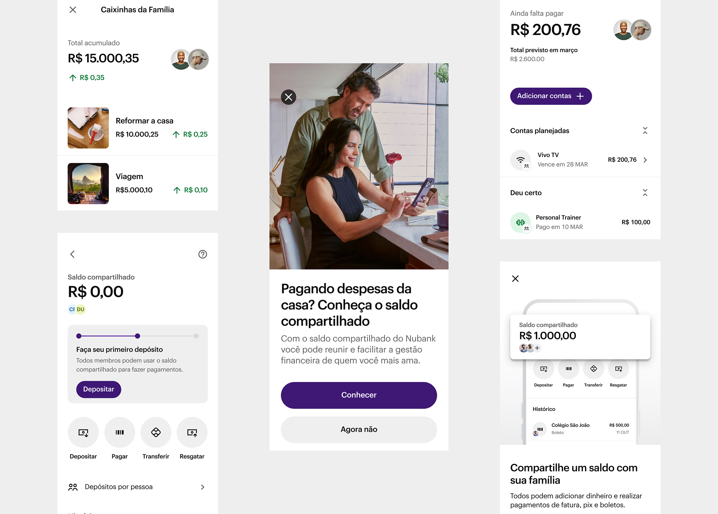
✎ Activation & Engagement Through A/B Testing: Designed and led the execution of tests focused on resolving entry barriers and low engagement, focusing on improving Onboarding Activation and Widget's CTR (Click-Through Rate), achieving significant growth in Monthly Active Users (MAU) and First Deposit rates.
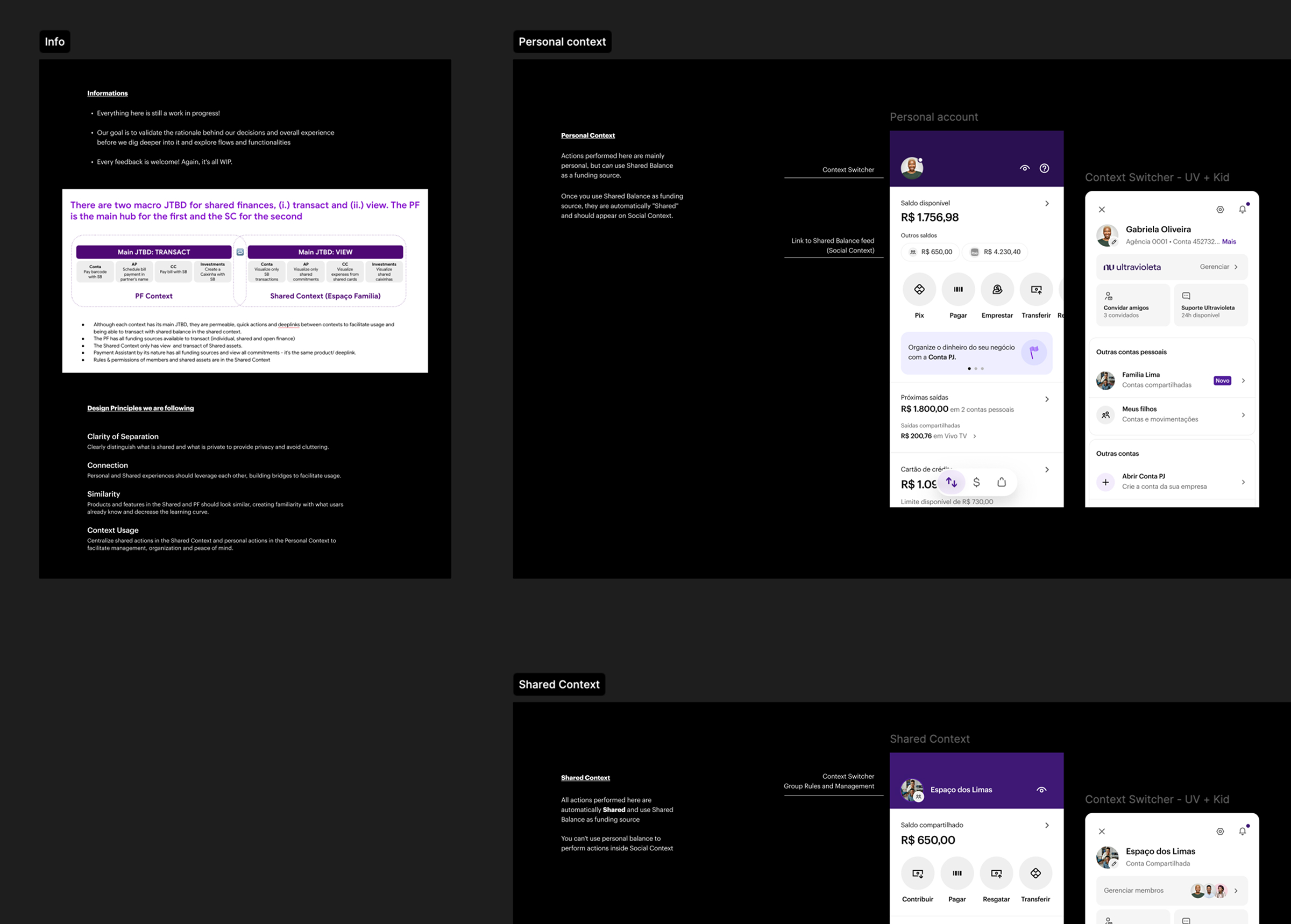
✎ Entry Point Redesign: Increased the entry point's findability by pairing with key teams to create a design solution for displaying the Shared Balance within the App Home and Personal Account's Dashboard, resolving a major user pain point.
